
A Good n Proper Rebrand
Good n Proper launched back in May 2023 with the single aim of being the digital marketing agency that I would have wanted to hire when working in-house.
We've grown to work with incredible brands like Levi Roots, Mission Mars, BOXPARK, plus a few that we're not even able to talk about yet.
So it's been busy!
The proposition was clear from the start. Be normal. No showmanship. No fluff. Just the fundamentals of marketing, done really well.
But the brand's look and feel had never been as clear.
It was created and developed over sneaky evenings spent in pubs and bars across Leeds (212, we love you), but it was always a visual representation of something that didn't yet exist. So it was a bit of a punt.
Now that we've lived it, it felt like a good time to freshen things up and make it a better reflection of who we are today.
But rebrands can be tricky to get right.
Too subtle and it's deemed a waste of money and effort (see: Gov.uk).
Go too far, and you risk losing all your hard-earned brand equity (see: Jaguar).
Here's an honest take on what we've updated and why.
No more extra ordinary
At the very start, we had a very provocative tagline where we claimed to hate marketing altogether.

Quite quickly, this felt OTT.
We never set out to be a "disruptive", outspoken agency. To be honest, they're part of the problem (saying f#ck doesn't make you cool, lads).
We just wanted to highlight why marketing agencies can get a bad name through overpromising and underdelivering. And then...just not be like that.
That led to us dubbing ourselves "extra ordinary".
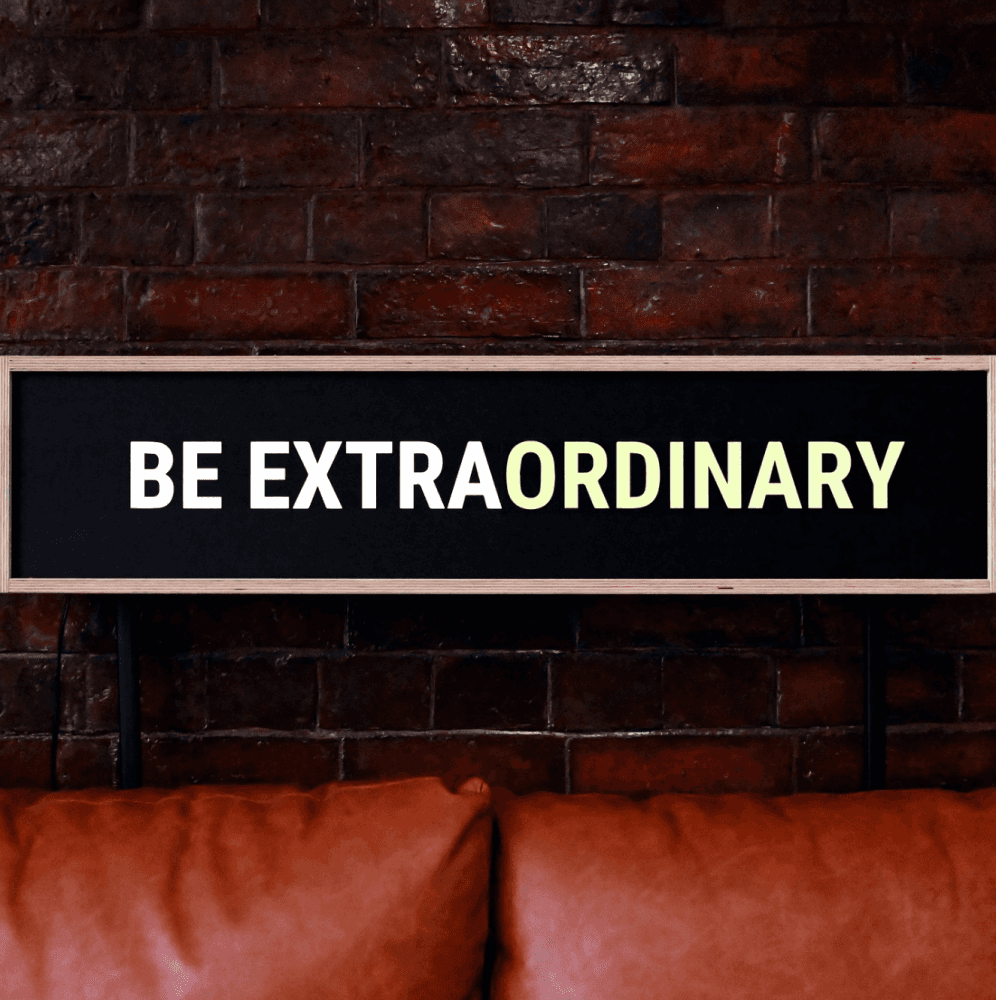
This play on words was a direct counter to the adjective-heavy descriptions you always see from marketing agencies.
The aim was to take the piss a bit and state that being "ordinary" was actually OK. Substance first, jazz hands optional.
We're the extra ordinary marketing agency. When we say ordinary, we mean we do the tried-and-tested marketing fundamentals, and we do them well.
But let's be honest, it doesn't matter if the tagline is clever - if you have to explain it when saying it out loud, it ain't gonna work ("yeah, we're extra ordinary. like extraordinary but the pause means that we're ordinary. not ordinary in a bad way though. hello?")
The sentiment behind all of that remained. We just needed something clearer and simpler.
Digital marketing done right
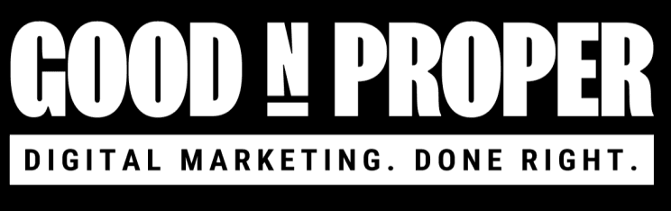
Stripping it right back, we settled on "digital marketing done right" as the tagline.
Nowt fancy. Not trying to be clever. Just a succinct way of explaining how we do things.
We also created logo versions that incorporated the strapline.
Job done.
Black and white
There's a reason for the phrase "in black and white".
With an emphasis on clarity and simplicity, using black and white as our core colours always made sense.
The rest of the secondary colour palette was totally stripped out, except for lime green. We felt that given it was used quite a lot in the original brand, it had become a distinctive brand asset, so we could keep to use very sparingly to accentuate key points and highlights.
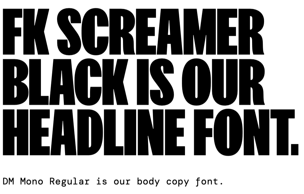
We also updated the fonts for greater impact and contrast. FK Screamer became our headline font, helping to deliver our no-nonsense, straight-talking approach to messaging with strong impact.
DM Mono also became our body copy font. This monospaced serif font is simple and works alongside FK Screamer to reflect our ‘no-fuss’ attitude, with no unnecessary decoration or complication.
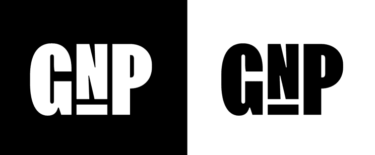
GnP
One happy accident has been adopting GnP as the business's moniker.
Clients use it for speed, but we hadn't even considered it a thing before that.
So for smaller usages (e.g. social), we knocked up a GnP logo that fits into the wider style.
New Website
The priority for our original website was for it to just look great. In hindsight, this was against everything we were actually pushing for.
We (I) had also probably taken some of the concepts too far.
Think: unnecessary animations, 1950s characters and elaborate illustrations.

They were all there for the same reason: to illustrate what we weren't. But it just led to a very cluttered set of messages that was a lot to take in.
So again, we simplified everything.
The website was stripped right back to proritise the actual content, with fast load speeds to make sure people could interact with it efficiently.
Less showmanship, more substance.
We also put time and effort into making sure our case studies showed off our work as best as possible. Particularly for content creation - there's one thing describing a piece of content you've created. But...why not just show it?

Huge thanks to Simon Morgan at Bread & Butter for working with us to bring it all to life. Legend.
All thoughts and feedback are welcome.
Apart from on the website - I built that myself in evenings. I'm sensitive ok.